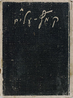
Given that the journals themselves were handwritten, we left a handwritten option for the title, but for readability sake, we prefer the "old printed book" metaphor.
Color was based on old books and posters from the 1930s and 1940s. We prefer the first color scheme because it provides some contrasting colors, but provided a few options. The textures are darker in color, but they can be colorized, and were selected to imitate handmade book materials (linen).
We additionally used the image of the front of Leah's diary to create some signature elements.
While this will be used to guide our design of the website, there may be carryover into titles, segue design, credits, etc. in the final show. Chad is working on turning the mood board into a "style tile," translating the design elements into a more cohesive image.
If you have any feedback please comment!


I absolutely adore what you've done with the work from Leah's journal cover. It's very personal, and reiterates that this story was not written in English, and that this story did travel to America, along with Leah. Although I stress that we find out what exactly it translates to.
ReplyDeleteI do think we should careful with the color palette, I personally have an affinity for the first swatch of colors. The website needs to be inspiring and respectful, if the colors are too dark it may take away from this. While darker shades provoke a solemn tone; the ultimate purpose of this project is to encourage people to remember the past through proper preservation, this to me seems to be a more a cathartic emotion.